1. Written Content
In order to make the text more easily comprehensible, even for dysgraphics who make approximately 1 to 2 % within the Czech population, it is vitally important to follow several principles.
The text should primarily be unambiguous and written by a vernacular language. All these would-be expert neologisms worsen the legibility of the text and its subsequent understanding. The abbreviations should be also avoided, particularly the less-known ones.
Organisation and cohesion of the text appears to be even more important. Logical, not too long paragraphs, which are ideally not finished at the end of the line but on the contrary provide sufficiently long gap, should be taken for granted; the readers thus have some clues and checkpoints to which they can return.
When it comes to web accessibility, it is also crucial to follow the correct semantic signs in HTML code. For instance when inserting the lists, it is necessary to use certain tags <ul>, <ol>, <li>, and in case of special text some adequate tag types <strong>, <code>, <abbr>, and <blockquote>.
For all users it is more pleasant for the background and text to have a suitable contrast. The dark font on a bright background is the most frequent one, and on the contrary. The more legible text saves both effort and consumed energy since in the bad light conditions the brightness of the monitor must be enhanced.
2. Headings and Headlines (H1-H6)
Another aspect is using headings and headlines; not only do they have an immense impact on a more logical organisation of the text, but also they might help for the blind to navigate better. Most reading devices offer a structured list of headings and headlines as a text content which significantly simplifies text-orientation on the website.
Furthermore, their use might bring a pleasant marketing bonus since due to the headings and headlines, the search engines find out what the article is about. As a result, when searching, you might level up in the results and thus increase the web traffic.
3. An Accessible Control
The people with disabilities who browse on the web using assisting technologies are restricted in many ways; as a result, it is uneasy for them to control some of the interactive elements on the page. For instance the blind do not need to use a mouse at all for it would be almost impossible to indicate the location of the cursor. Therefore to make the web accessible for them, the possibility of using nothing but keyboard to browse is utmost crucial.
The text-orientation on the web is also made easier when a sufficiently highlighted element is applied (see the picture below). The highlight should provide a sufficient contrast – not just soft brightening or darkening – and particularly should not be related to the mouse movement only. The implementation of this function in CSS takes only a few minutes but makes the text-orientation far more pleasant for the ordinary site visitors as well.
A sufficiently highlighted focus might help not only to people with partial visual impairment, but also to other users. Source: Blindfriendly.cz
Reading device users will appreciate the option to skip individual parts, particularly the ones which are repeated on each site. The web navigations system might be formed using an outline, links to anchors (footholds on the site) and links hidden at the beginning of the website (so called skip links); last but not least, website restrictions using certain elements and roles In HTML might also help.
Carousels, or so-called rotating banners, which often display news and pivotal information, might imply a potential problem. Therefore it is more practical both for the people with and without visual impairment when it is possible to stop the banner on the current website.
Generally it is necessary to obey the elementary principle of accessibility – if you insert any special element on the website, always make sure it will be legible for the users with impariments and that it is controllable by the keypad, ergo it is possible to specify the type of the element, its description and state, and the element’s content.
Also beware of the instructions being explicitly dependent on recognition of a certain element, such as “In order to continue, indicate all squares” or “Having heard the sound signal, immediately click on the button”.
4. Audio and Video
It is certainly time-demanding to create audio-visual text transcripts, hence it is clear there is often not time enough to do so. However if you insist on an entirely accessible web, in case of audio and video it is the easiest way.
Moreover, the transcript might also suit both to people with and without impairment. They are thus not forced to go through the whole podcast and video in order to find the item of information. Last but not least, the transcript prevents from users’ potential technical problems.
Some videos are provided with subtitles. It is necessary to consider though whether they are actually able to present adequate information. If you choose common translation subtitles, you should be certain that the deaf and the hard of hearing will be able to hear everything, since the translation subtitles unfortunately do not present who is speaking and mostly do not include non-verbal sounds such as ringing the bell and bomb explosion; as a result, the spectator might miss some important information.
That is why the deaf use so-called hidden subtitles which separate the characters’ voices in colour and also involve other key sounds. Apparently to make such subtitles is even more difficult but in order to comprehend the content entirely it seems necessary.
5. External Players in Use
A popular way of making the web more attractive is using external content from YouTube, Soundcloud and other similar audio-visual servers. Except for the player code though it is advisable to upload the link for an original source as well, so that the accessibility is ensured. It often happens that in original there usually are more functions that make the content accessible. Of those, automatically generated subtitles are available.
However it is still necessary to check whether the inserted player contains at least the elementary controls, i.e. play/pause, in order to control it using keyboard shortcuts.
Nevertheless never ever use autoplay both in external and/or all audio-visual media. For the people with and without disabilities it might be highly unpleasant and confusing in general, and particularly for the blind it disrupts the text-orientation in the website.
6. Pictures, Diagrams and Charts
Pictures always need either an alternative text or a caption. You may use both but the text should not repeat, they had better complete each other.
Nevertheless not only the pictures but also machine-illegible graphs and image charts should in an alternative text contain particularly a factual summary of information which a certain graphic element features.
For the blind image buttons and other image control elements that do not have an alternative description might be a particular complication. In these moments the blind might be stuck because they do not know what they should be doing and what options they have.
When using a graphic CAPTCHA on the web, complete it with a sound alternative. The people with visual impairment will appreciate it.
The fundamental information of your company, such as its name, contacts and addresses, ought not to be in a form of an image, but as a text. All visitors in general will be thankful for being able to copy the information simply and fast as a text.
7. Colour Contrast
Approximately 8% of male and 1% of female population find it hard to recognise different shades of colours. Unless the information expresses some sort of information, in many cases it becomes inaccessible. For instance the colourful graphs, which in original look well-organised, might appear confusing in black-and-white. In the picture below you can see that the contrast of red and green colour looks practically the same hence to match the legends to the slices is hardly possible.
Using a white-and-black and monochromatic screen might represent a very similar issue. Thus when creating similar graphs and diagrams, make sure they are comprehensible both in colourful and colourless variety.
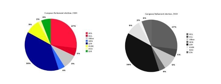
An example of a wring contrast in a colourful and colourless variety. Source: Liftarn, 2009
8. Other Graphical Issues
Most webs comply certain customs concerning the location of buttons and other elements on websites, for example ‘log in’ in the upper right corner, click vector logo on the introductory site in the left upper corner and a social network link in the header. The adherence to such customs will make your web more accessible and will simplify the text-orientation for all.
Flashing elements often cause discomfort to the users without impairment as well. The people with cognitive impairment and attention disorder will find such flashing unappealing and will not prevent them from concentrating. Particularly epileptics, for whom it might present a serious threat of a seizure, will appreciate its absence. To conclude, the flashing elements should be avoided completely.
Decorative animations on website might look interesting, but for the people with visual impairment and attention disorder are confusing and make the text-orientation on the web difficult.
9. Hypertext Links
Not very well-defined links are a frequent flaw against accessibility. Various reading devices for the people with impairment make it feasible to display exclusively the links so that other text is ignored. When using a universal text such as ‘read more, for further information click here’, the visitor has absolutely no chance to find out where the link is directed and what it is concerned with.
The text of the link thus should contain the most apt description of where it directs the visitor to. Another option is to add an alternative description which clearly conveys information about what the hypertext link refers to and thus ensures that the link is comprehensible from the context.
However enough is enough, and this also applies to hypertext links. Therefore if the texts are too long, the search becomes more difficult. Thus it is more convenient, primarily for the reading device users, when the link text never starts with the same letter; then it will be also easier to return to the texts.
10. Forms
To fill in a form requires precision. For the blind, and people with visual and cognitive impairment it might be difficult in three aspects; first of all, the text box labels, particularly the obligatory ones, must be distinct and accessible using assisting technologies for the users to be able to recognise what exactly they are writing in. In practice, HTML web code must be bound with the form element, such as editing field and check mark button, and a description underneath.
Another problem might emerge when it comes to error messages. If it is a form whose main purpose is to send confidential information about the users, the users should be able to withdraw from sending the form; as a result, sending a mistakenly filled form and/or form with error is prevented in advance.
11. Documents
In many articles and instructions it is possible to stumble across recommendations not to publish a PDF and/or DOCX content files, but straight as a text. In practice though, those should not be taken for granted. On the contrary, the web might then become even more inaccessible. Hence it is more advisable to have the information as a file to download, and when in pdf, always make sure it contains a text part as well. Furthermore, a current Word and Acrobat Reader versions have an integrated access control function.
Control Tools and Feedback
Nevertheless to watch all the above mentioned details, which undoubtedly make life easier to people with and without disabilities, is certainly difficult. Fortunately there are many tools that might help you. We have chosen just three of them – see below:
- Toptal Color Blind Filter is an online tool which, having inserted the URL address, will show you how the web is seen by the people with colour vision deficiency, i.e. they do not either perceive any of the colours and see just shades of grey, or they do not see the red, blue and green colour.

Comparison of how the Master.cz is seen by the people with and without a visual impairment. Source: Toptal Color Blind Filter
- Panel WAVE is a tool which might be installed into your web browser; you can see it next to your address bar as a “W” icon. When you then upload any website and click on the icon, the tool analyses the current page and graphically shows you the potential accessibility issues. Hence you can easily detect where an alternative text and/or a headline was dismissed.
- Voice-to-text transcription will help you with time-demanding transcriptions of audio-visual content. One of the easiest ways is a voice-transcription in Google documents; having opened a text file you may choose a voice-transcription just below the “Tools” tab.
There are certainly many more tools to be found in order to improve either a background-text contrast or to analyse your HTML code and suggest suitable adjustments. An immensely voluminous list of tools to improve accessibility might be found on the W3C pages, an international consortium for web standards. Always remember though that the results of such tools are automatically generated and must be thus seen only as provisional. Very often do the tools mistakenly display something that is not necessary to correct, for example a missing alternative text beside a decorative picture.
Nonetheless you should not rely on the tools only; the accessibility should be primarily tested by the users both with and without impairment – they should give you a feedback on what to further improve.
Having read as far as here, you are definitely on a good way to make your web more accessible to various groups of people with impairment. The accessibility issue is very complex and extensive, which is why this article cannot be taken as a definitive instruction to flawlessly accessible web. A simple website might be perfectly well handled with quality manuals and recommendations on the internet. The more complicated webs and/or e-shops are better to consult with professionals. Which is where we might be at hand. Master have been concerned with accessibility for a long time; we provide accessibility trainings and web accessibility analyses – including an elementary feedback for free.

